This is a selection of my journalistic work between 2014 and 2020, working in the data journalism teams of derStandard.at and Addendum
Not included is my work on Freedom of Information with Forum Informationsfreiheit.
This is a selection of my journalistic work between 2014 and 2020, working in the data journalism teams of derStandard.at and Addendum
Not included is my work on Freedom of Information with Forum Informationsfreiheit.
I send locally-relevant data straight to people’s inboxes, as an alternative – or additional offer – to making them visit the website and search for their district every day.
This was originally planned as an Addendum.org service, but before launched it, the coming end of Addendum’s was announced. We managed to launch it in a way that would let me operate it privately on Corona-Ampel.org, while co-launching it as a final Addendum project.
I’m placing a lot of emphasis on providing a clear methodology documentation and explanations around the data.
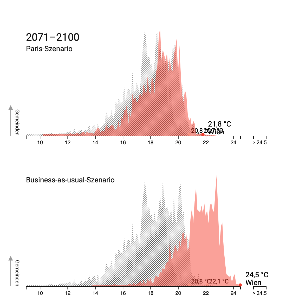
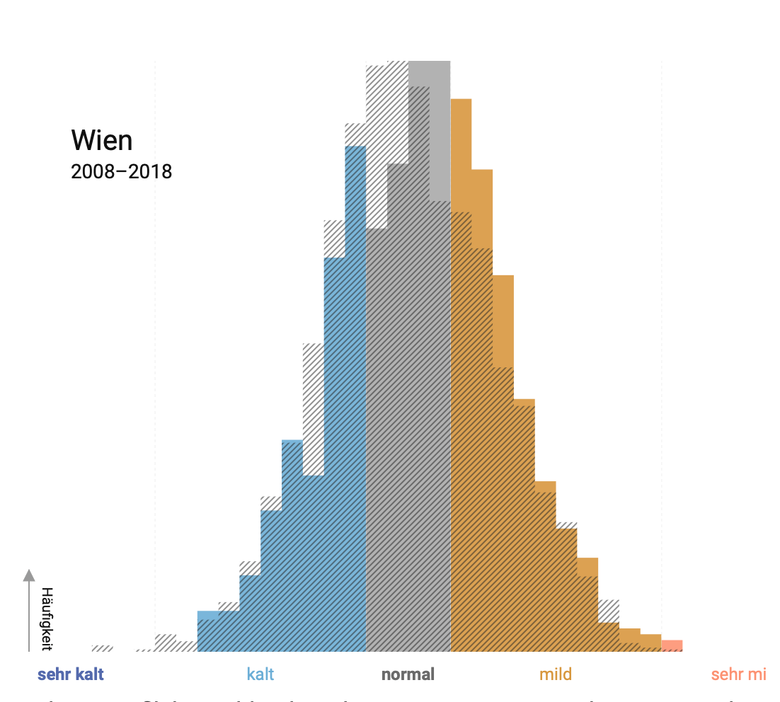
I was responsible for the data analysis pipeline between a series of articles covering three seasons. We visualized how warmer summers, warmer winters and earlier spring will impact locally, for all 2100 municipalities. For this, we processed raw geo grid data of previous years’ temperatures and multiple projections obtained from climate scientists.
We also covered storms, heavy rainfall and other incidents on a local level.
For all these, we created local reports for local newspapers, which enabled them to create their own stories around the data and copublish our stories.
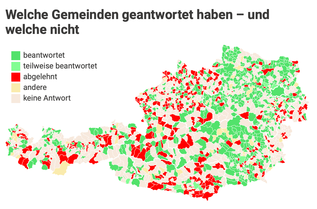
Subventions have regularly been cited as a source for cost cuts, especially projects that received money from multiple authorities. However, they’re usually less than transparent. We asked all 2100 municipalities about their subventions in the sports and culture categories and received data from about a third of local authorities.
I then created a database of all the disclosures, analyzed them and wrote multiple articles on the topic. I also helped produce videos about some interesting cases we found using the data.
We took some of the authorities that denied our requests to court and won all cases that were judged on their merits.
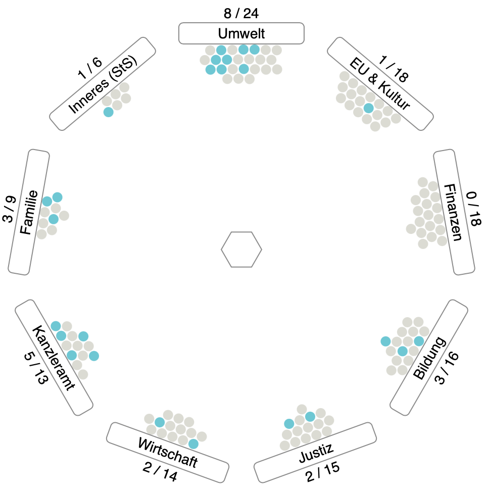
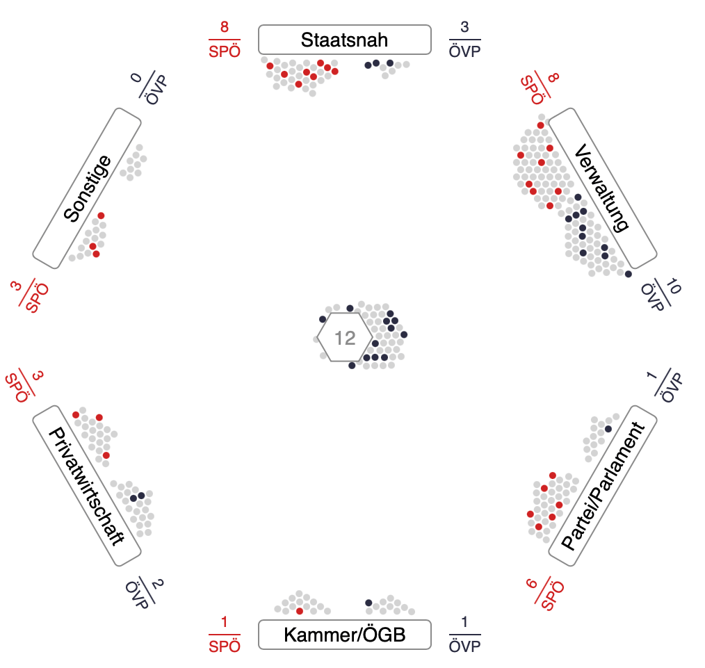
Multiple articles on cabinet members of one outgoing government and one incoming government on which sectors cabinet members ended up in (some moved to party jobs, some to public service positions), and which sectors they worked for previously.
Helped analyze a dataset prepared by coworkers and conceptualize the visualization.
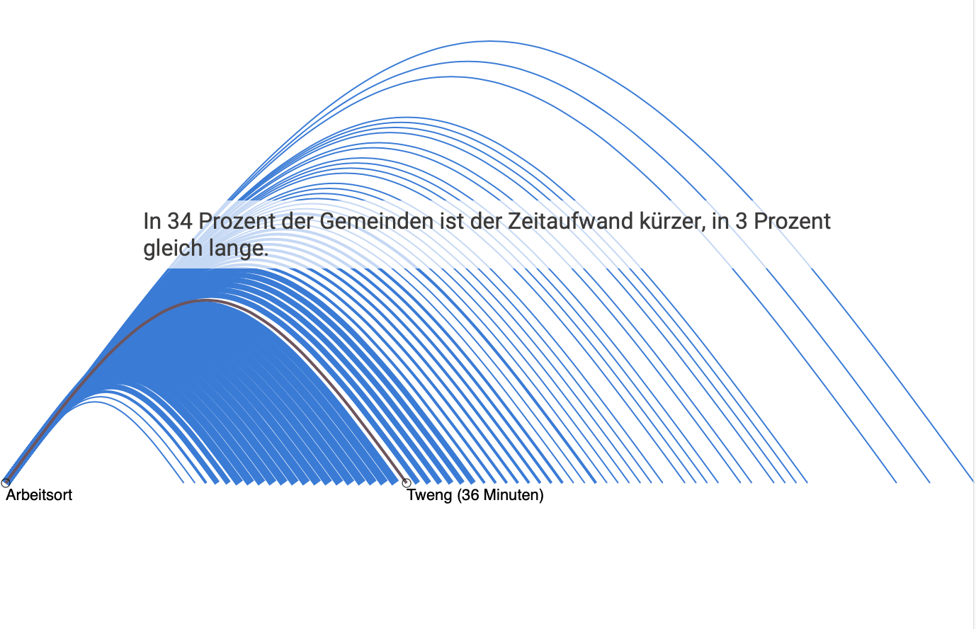
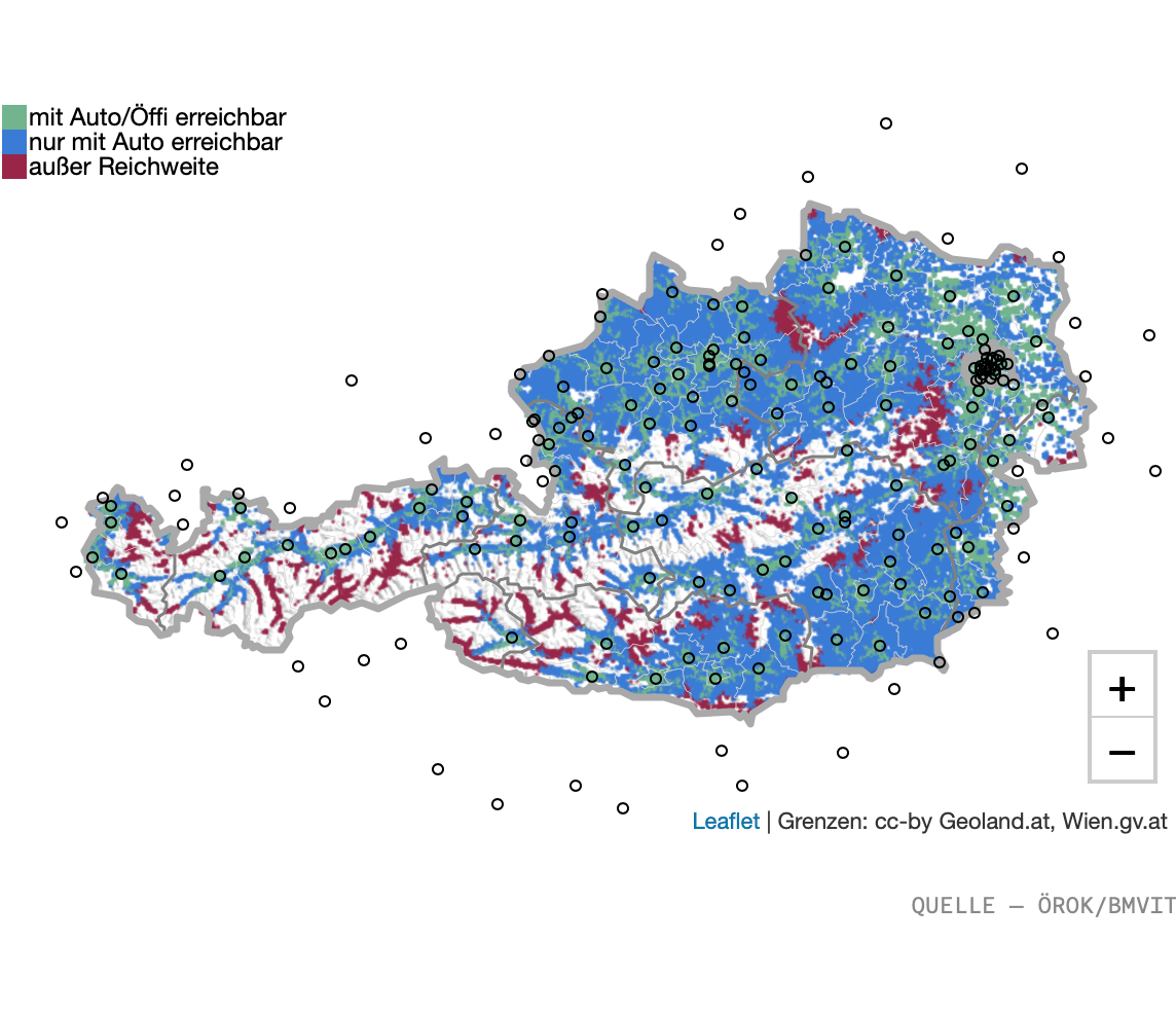
For this analysis of commuter streams and area reachabilities by public transport I was in charge of data analysis and transformation. I also rendered detailed maps based on detailed geodata.
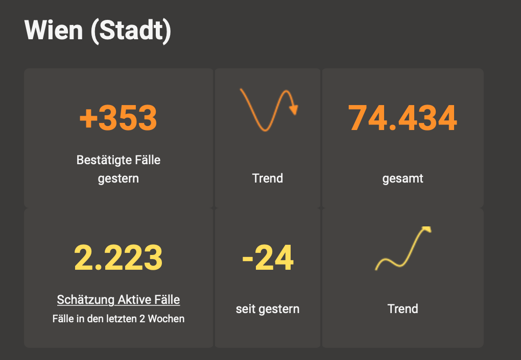
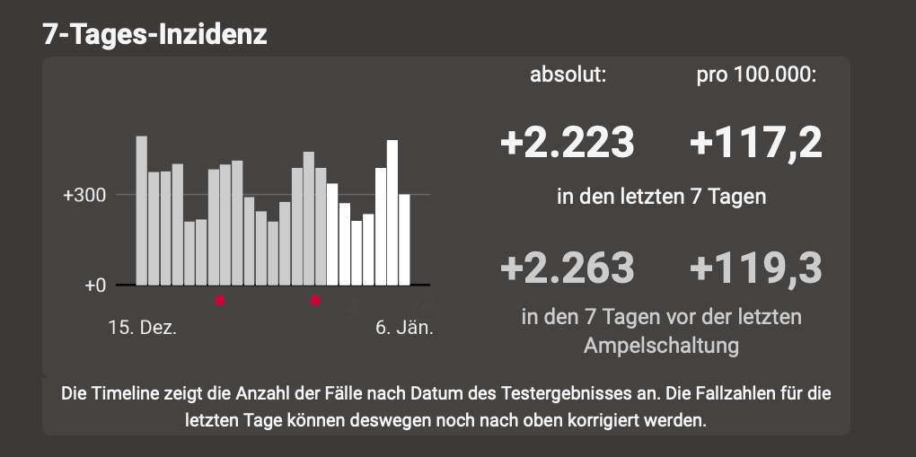
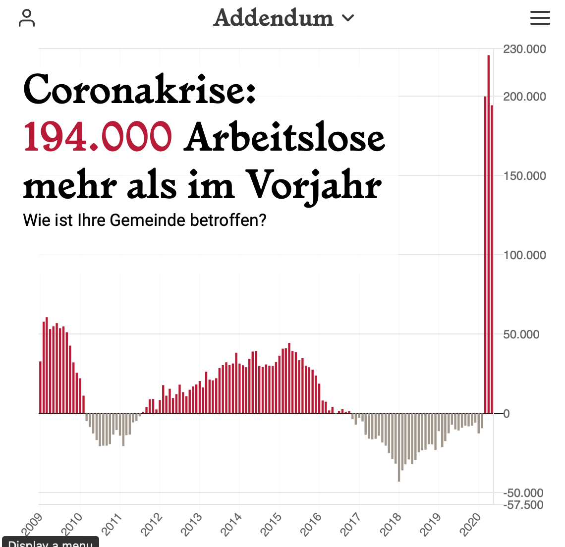
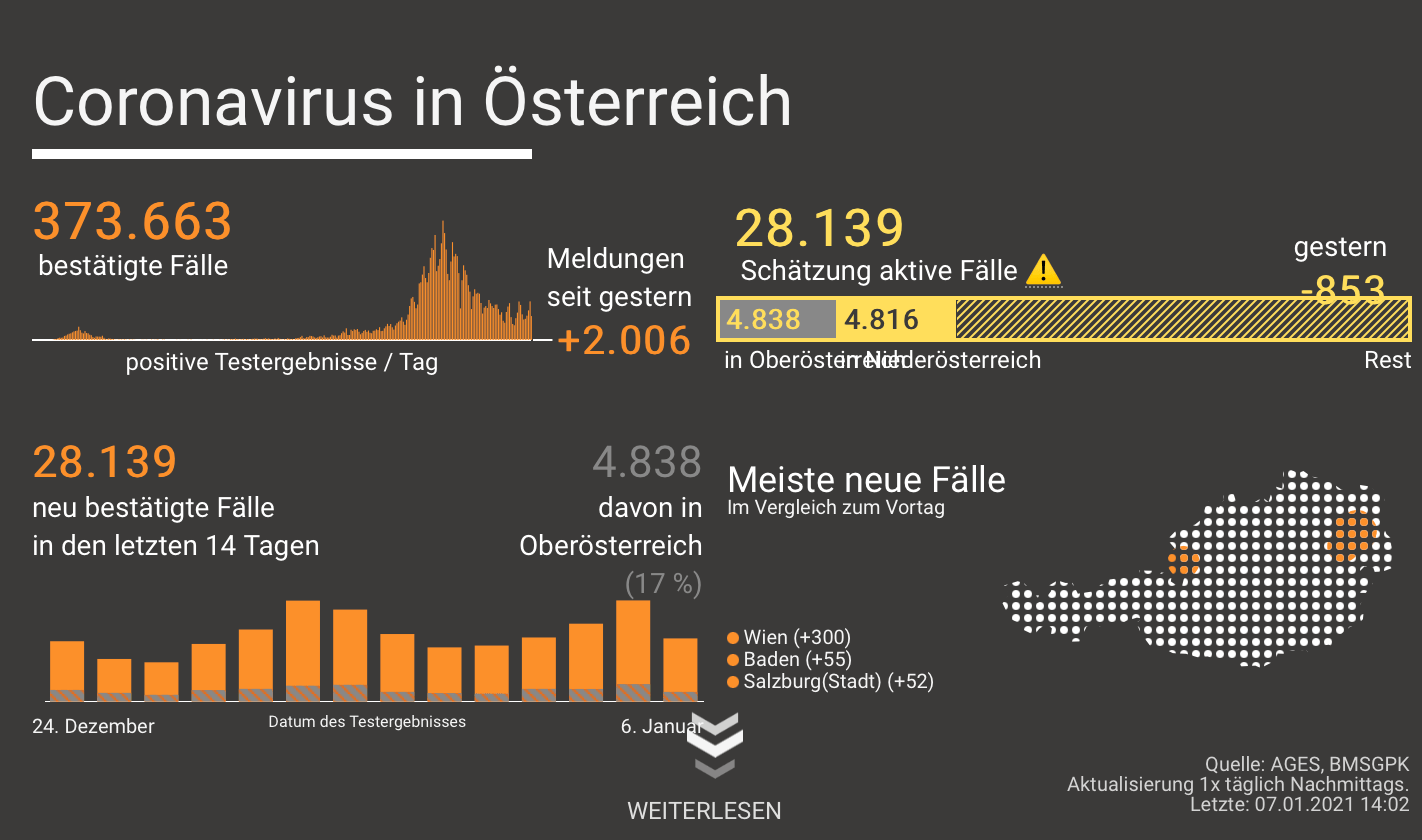
Early on, we decided to create a „dashboard“ of covid data. This quickly became the most-read piece in Addendum’s history. Before local data was published regularly, we set up an effort with lots of colleagues to call every state every day and collect current case data. The technical and automation side was all my work. A R pipeline was set up on a server to collect data and automatically redeploy charts when new data is available.
We also published (and regularly updated) job market data on the pandemic’s impact.
One guiding principle in our publications was to explain everything – what data means, how it is collected by the public bodies, which questions can’t be answered using it. We also put a focus on information we thought should exist but was kept secret.
I also helped colleagues analyze covid-related tender data.

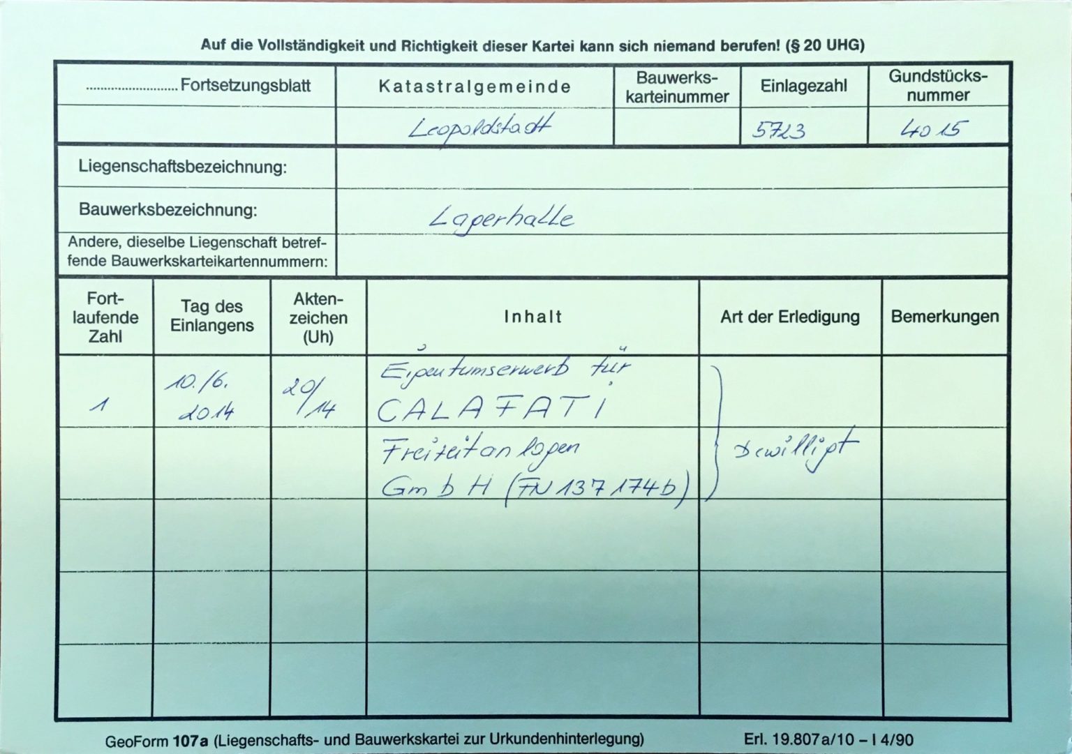
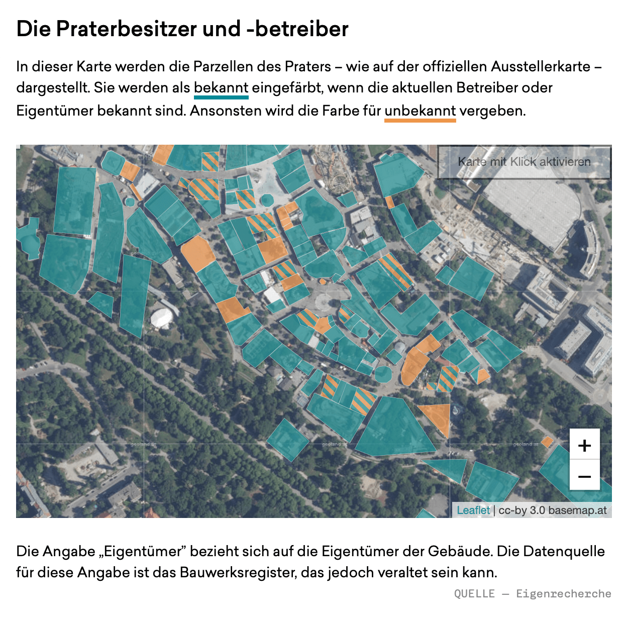
The amusement part Prater is owned and operated by the city (and its subsidiaries). However, private companies and persons own and operate the rides – and it’s not easy to find out who exactly owns what. Requests for the information were denied, so I reconstructed as much information as possible from public documents and created a map and a story using the information.
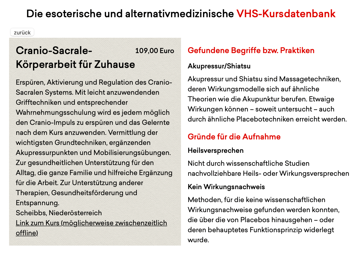
„No speculative methods without proof of effect“ is one of the rules the Austrian Community Colleges give themselves. However, lots of sports and wellness courses reference methods related to esotericism and alternative medicine methods. Scraping all course databases resulted in us finding courses on „homeopathy for children“ and „essential oils for children“.
We categorized these questionable courses in categories like „unproven“, „promise of healing“, „antiscientific buzzwords“ and produced short videos explaining the methods and how they’re either unproven or disproven. I created the database, wrote the story and assisted in video production.
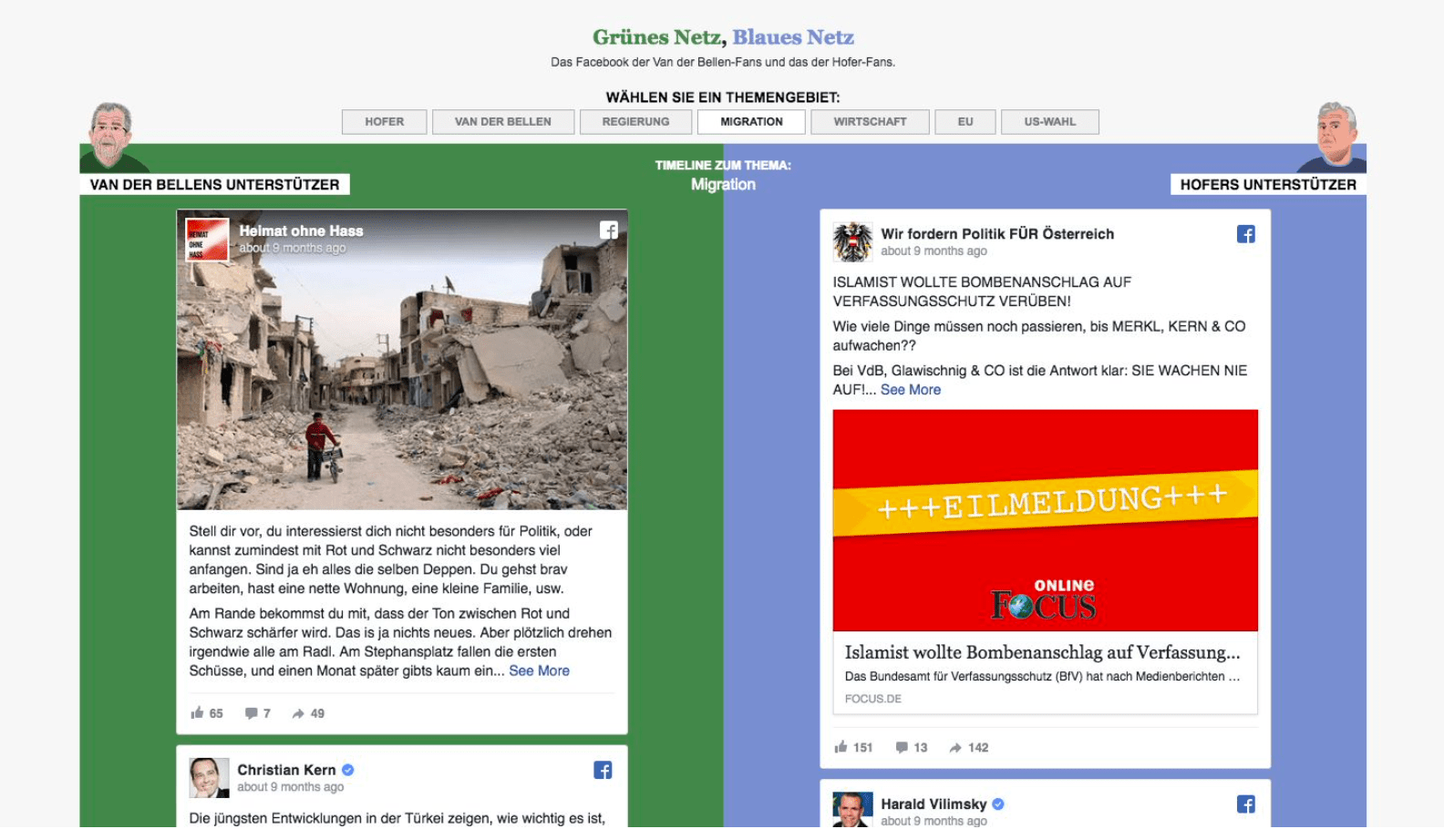
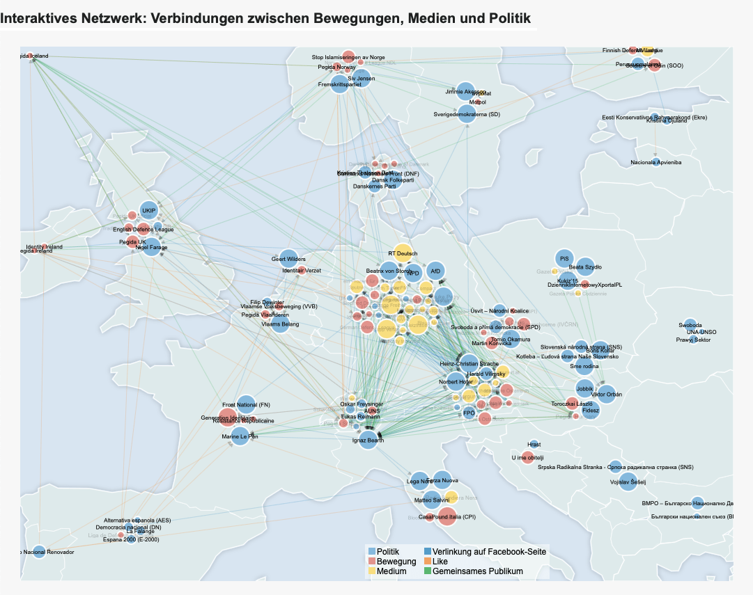
A year-long, Volkswagenstiftung-funded collaboration between journalists and academics focusing on right-wing networks across europe and their social media outlets.
Built a data stack for downloading information from public pages and websites. Developed methods (like the overlaps of people who like and comment on multiple pages) to discover connections between communities. Worked with colleagues who went to marches and had more domain experience to explain these connections, and the alternate media systems they often link to.
The interactive content in the following stories was broken by the outlet’s subsequent redesign
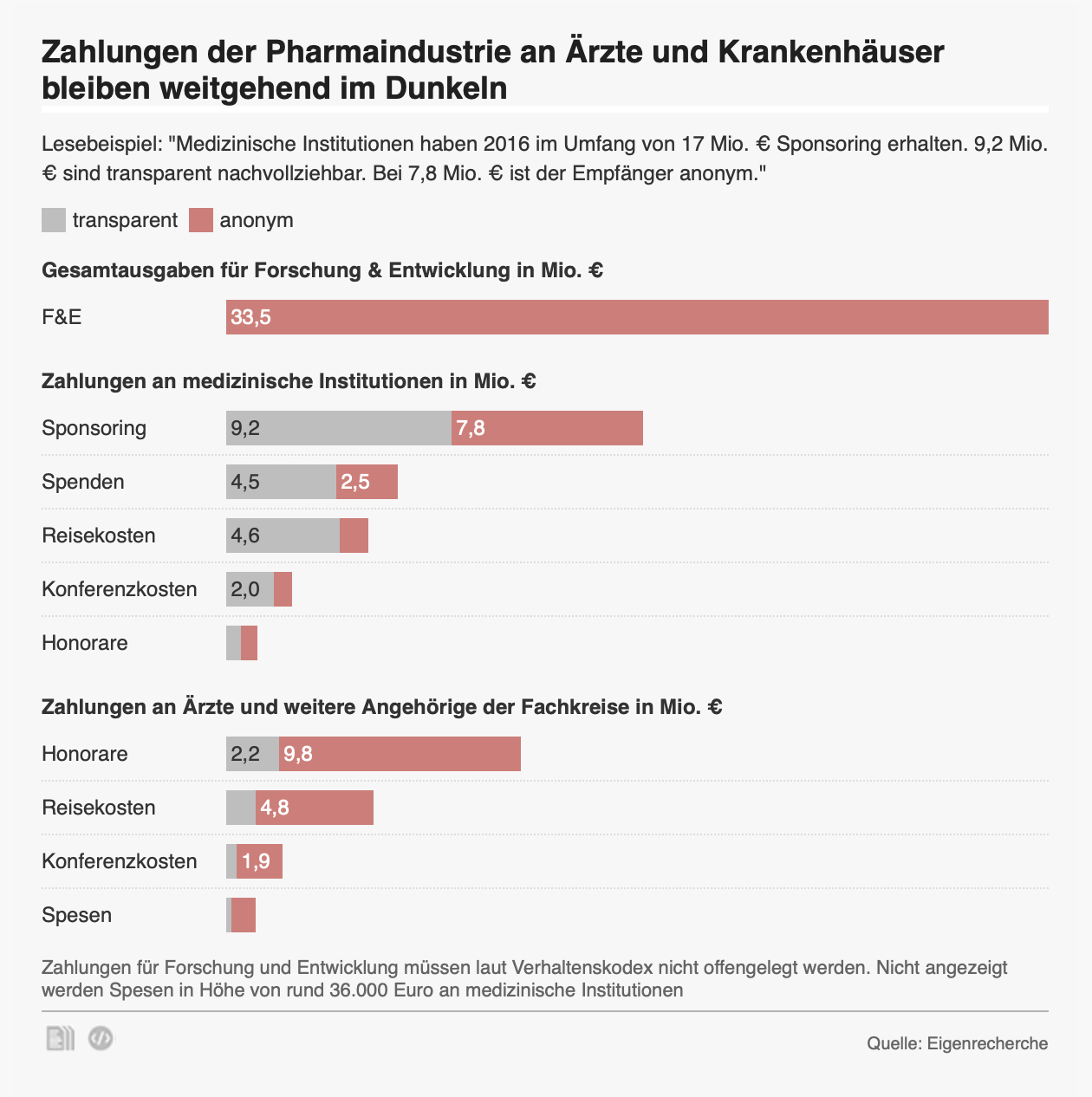
In 2016 and 2017, the derStandard.at data team collaborated with Correctiv.de and ORF to publish a „Dollars for Docs“ style database of all voluntary disclosures of payments to health care providers by pharma companies. We empathized the scientific evidence for such payments influencing providers’ decisions, and the missing transparency. Recipients of 80% of the payment amount was not made public.
We also found providers who received money but opted not to allow for the transactions to be made public.
These projects involved (sometimes manuall) digitizing deliberately hard to process PDF and image files, resulting in weeks of manual work. The resulting database was one no one had ever created for Austria.
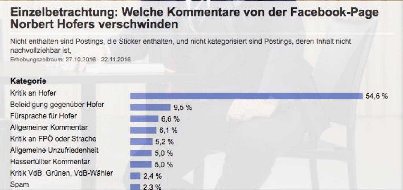
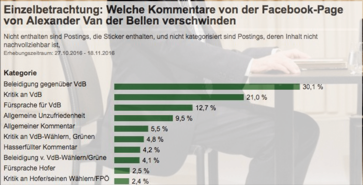
When there was public controversy about politicians deleting users’ comments from their public Facebook pages ahead of the presidential elections, we decided to „measure the unmeasured“.
During a Hackday, we decided to write a service that would save all comments from recent posts on a list of Facebook pages. If a post disappeared after being published, we would know it had been deleted – by the user, the page, or Facebook itself.
We published a story soon after, detailing the moderation behavior on facebook pages. To do this, we manually assigned the comments to categories like „factual criticism“, „insults“ and the like. We found large differences in the candidates’ moderation behaviors and verified our findings by contacting some users, to find out if they had deleted the comments themselves.
We used the tool for further elections until Facebook severely restricted API access, making it unusable.
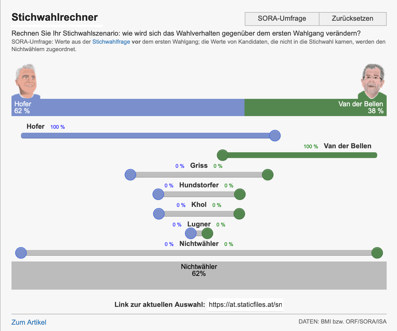
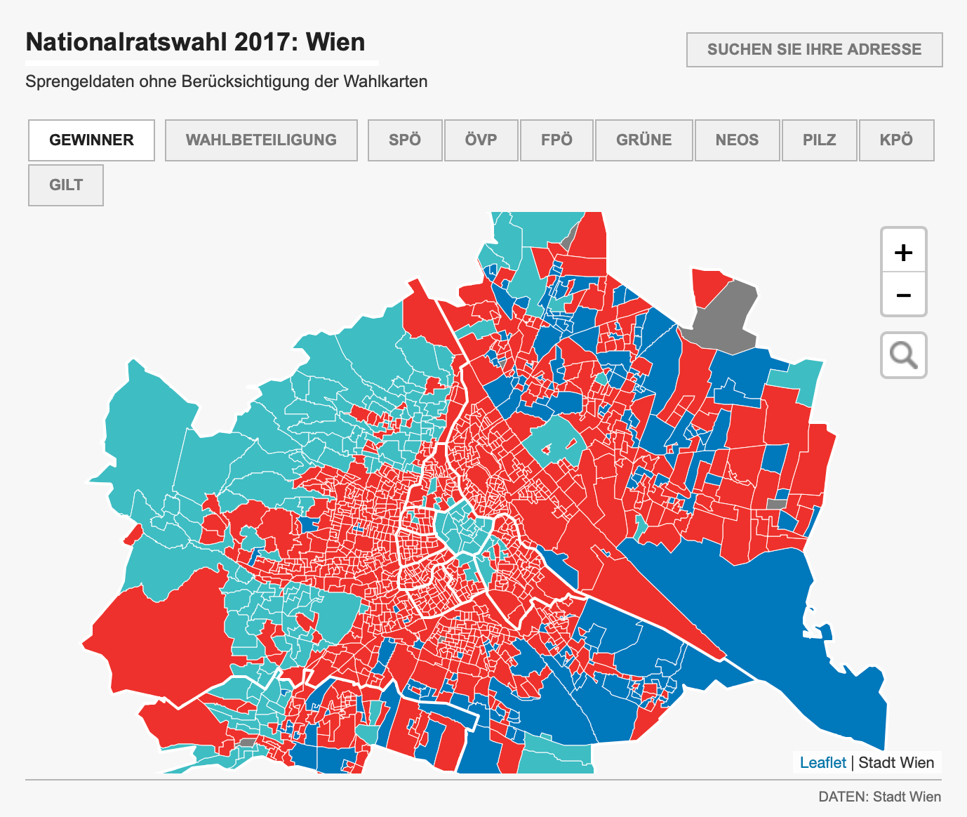
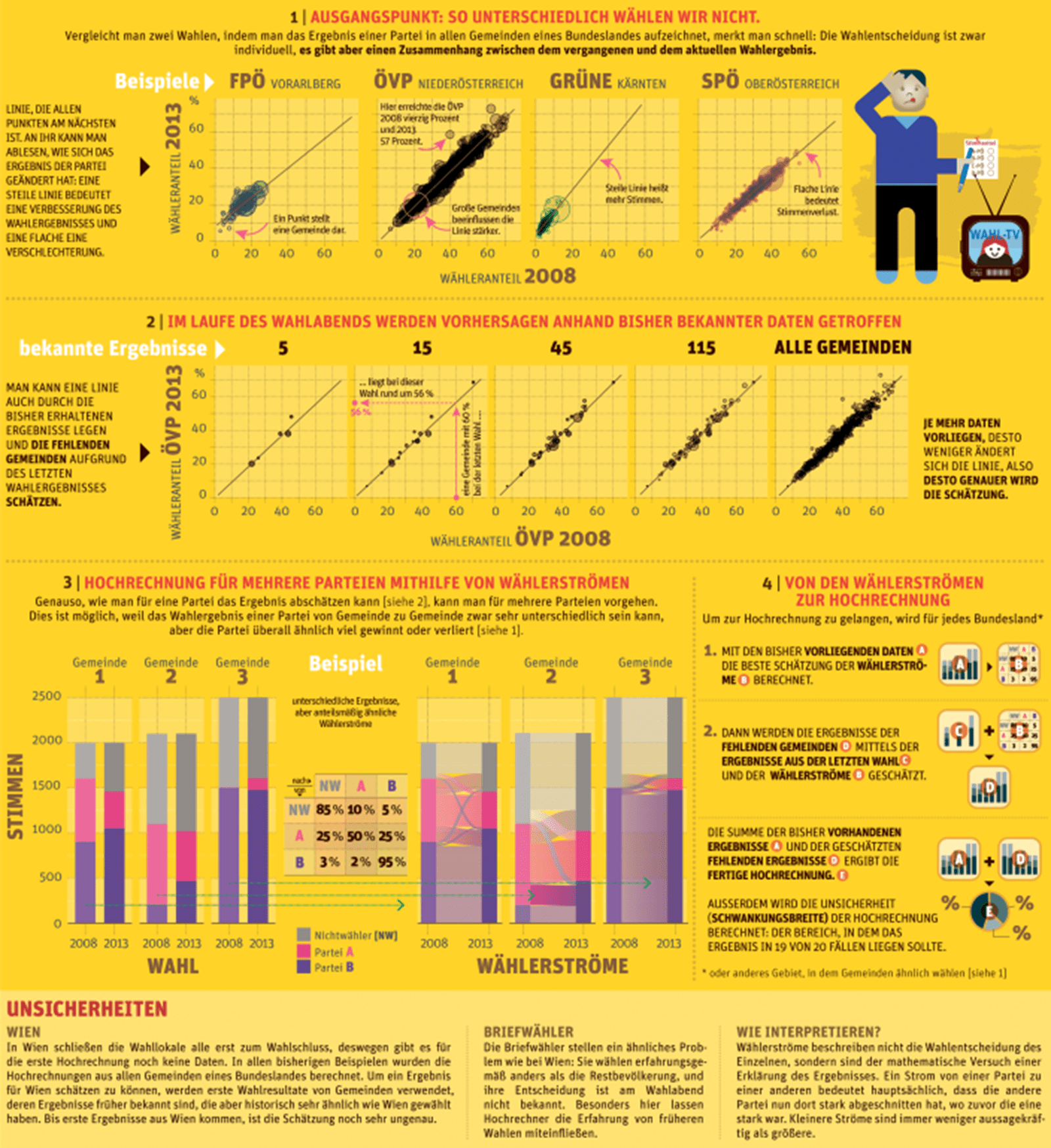
Built interactive election graphics and maps along with pipeline to update them near-realtime using projections and official data for election nights.
I was involved with all rounds of the presidential election in 2016, the parliamentary election in 2017 and several local and state elections. I also provided data to the print infographics teams in some of the elections.
A highlight was building interactive vote scenario tools for the presidential election runoff and analyzing local results. We were also the first Austrian team – to our knowledge – to publish election-night polling graphics with confidence intervals.
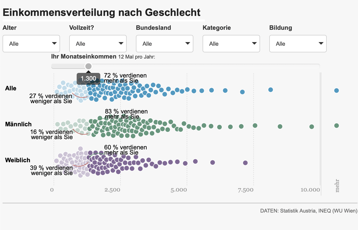
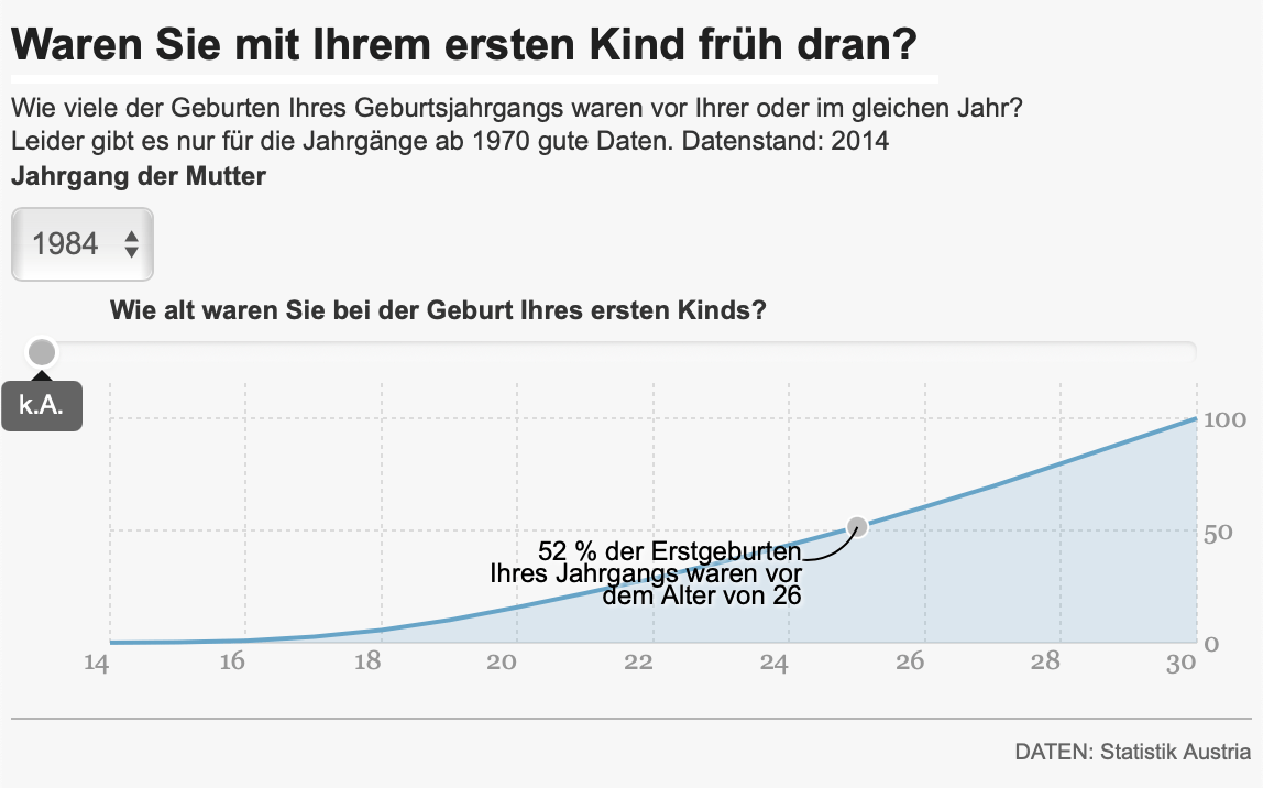
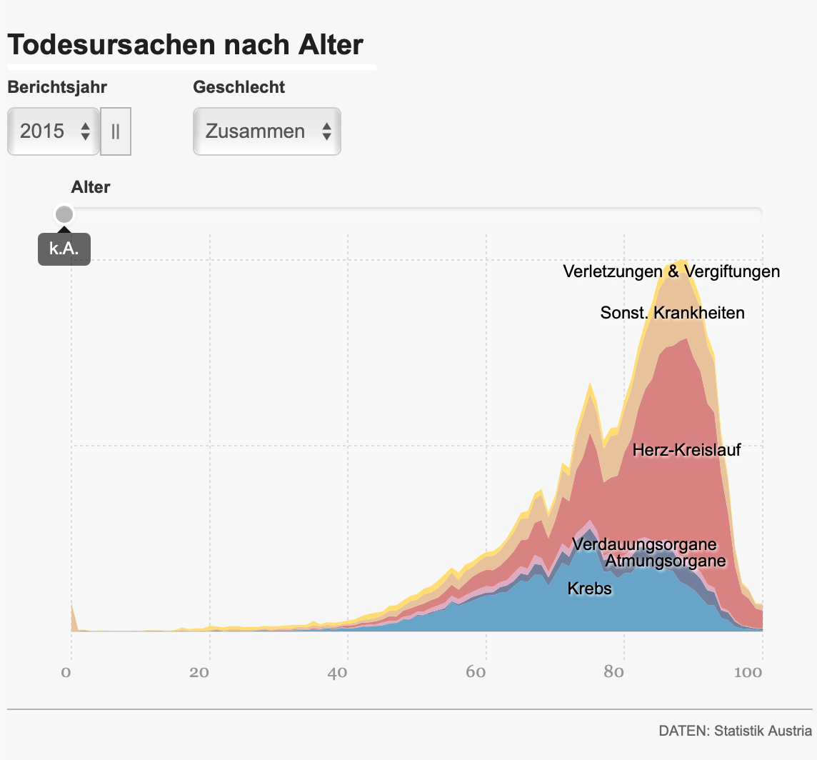
This series followed the theme of „finding oneself in the data“, namely in the income distributions, regarding when people marry and divorce, become parents, and die.
The „income distribution“ story was awarded a prize for economic journalism.
We visualized distributions/percentiles using an interactive tool that allowed readers to input their income/age and see where they fall in comparison to people in their demographic.
In 2014, Der Standard redesigned their weekend edition, creating a regular Page-2 data format.
Together with the print infographics team, I created one map (plus a small amount of explanatory text) a week for a year, before switching to a less restricted infographic format.
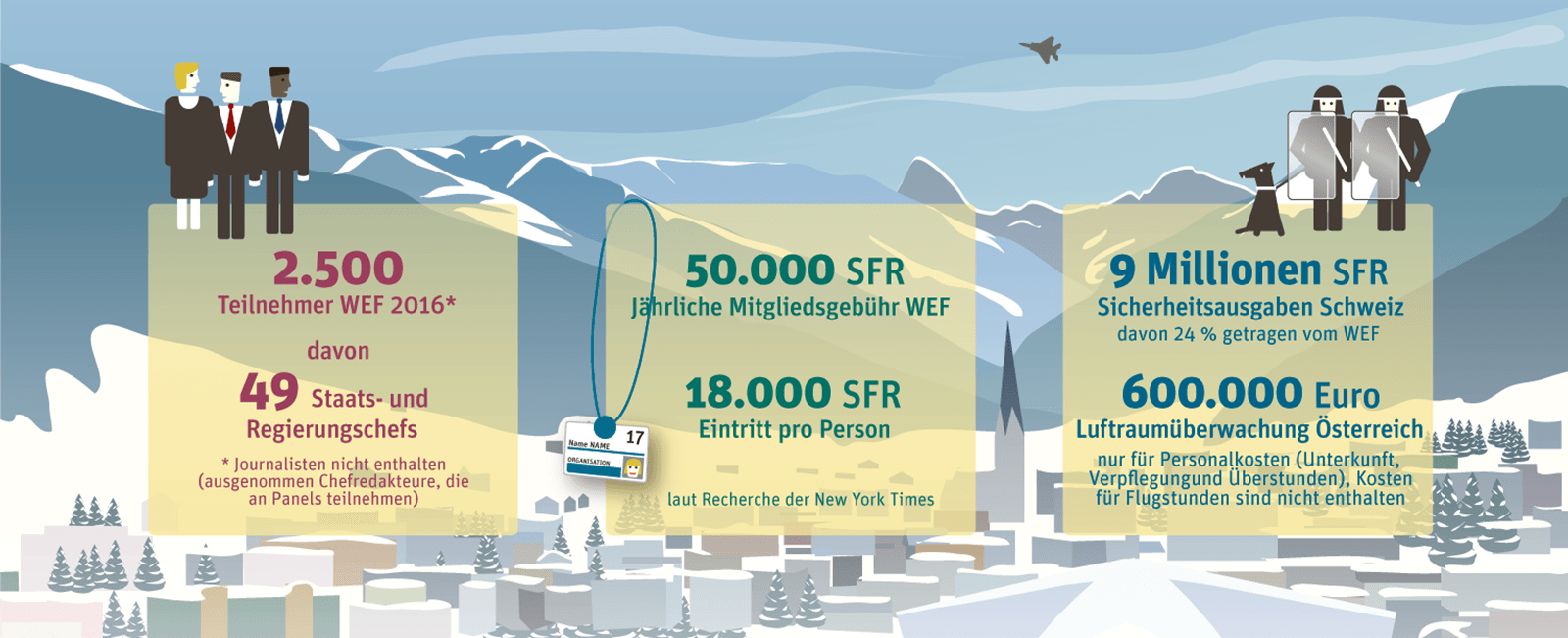
The largest challenge in these formats was finding the balance between the light-hearted tone expected from the page in general and still being journalistically relevant. A highlight was taking over the whole page the day before an election and explaining how election forecasts work.
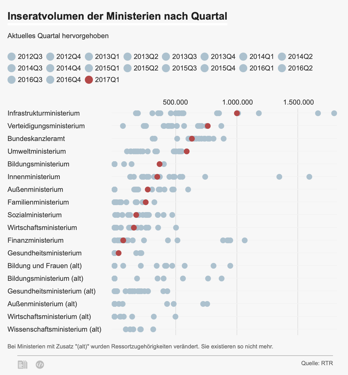
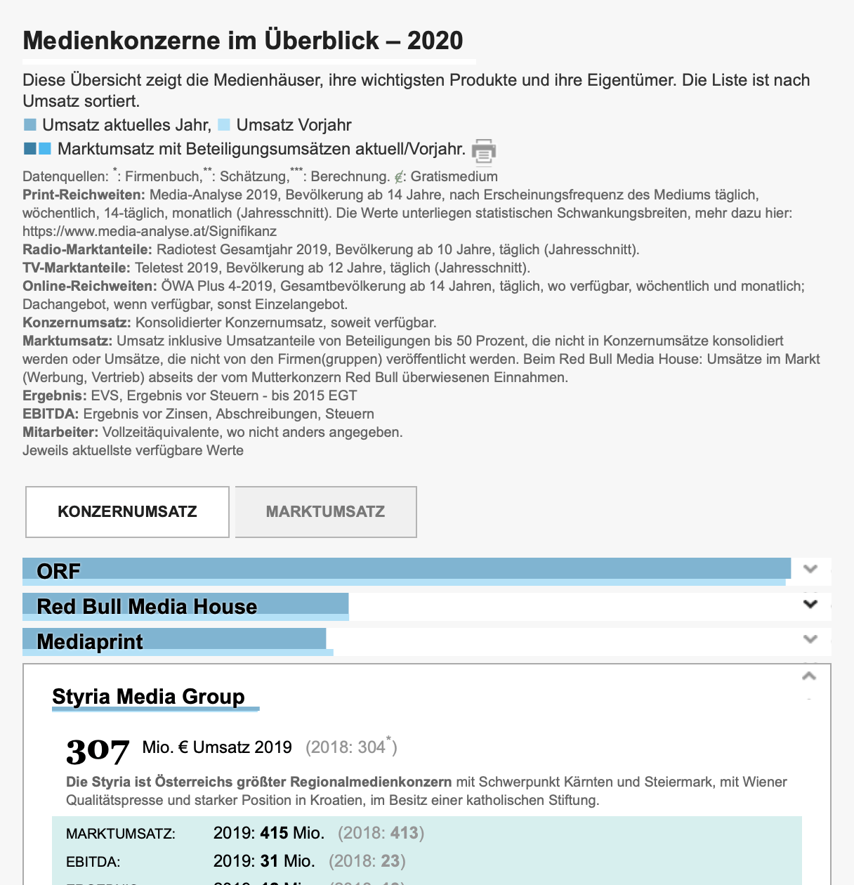
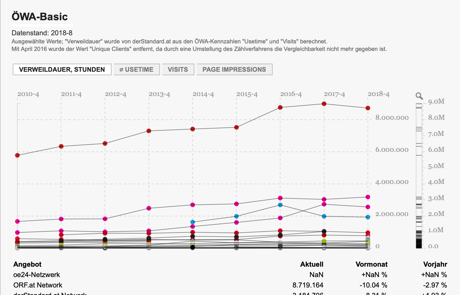
One of my regular responsibilities was visualizing monthly readership/reach numbers and quarterly government disclosures of advertising spending.
A Tableau Public version of readership/reach visualizations was already set up by my predecessors, however I eventually improved on the visualizations and reimplmemented them.
One further challenge was finding a format for an annual overview of the media market, undertaken by a colleague. I eventually created a format that allowed coworkers to easily update data and prose using a Google Docs / ArchieML-based system, which seems to be still in use as of 2020.
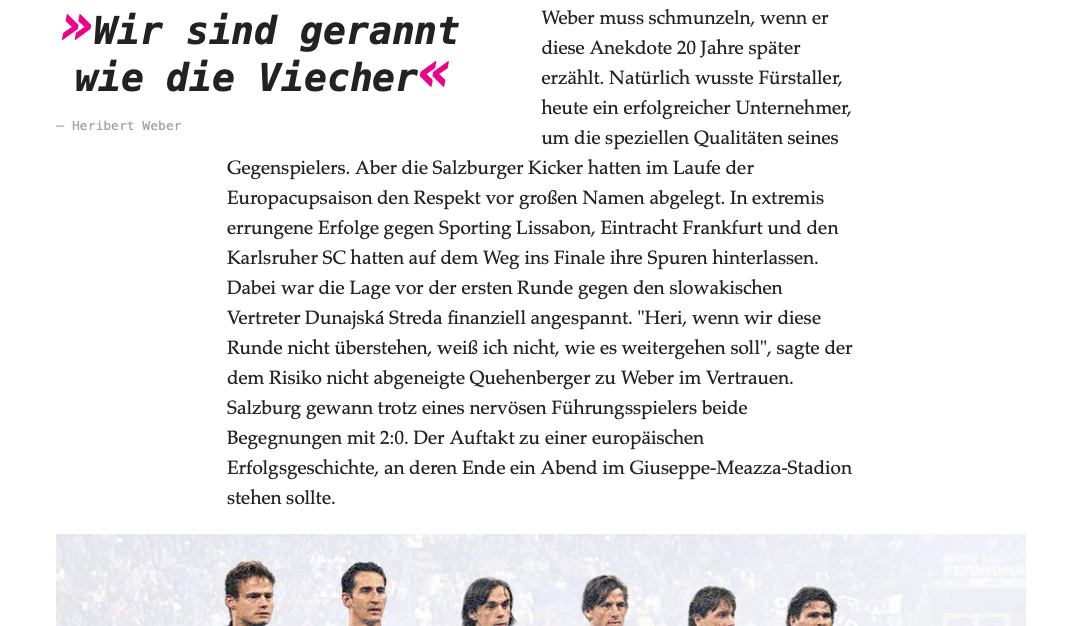
In 2014, derStandard.at only had a very basic, navigation-heavy article template to work with. To show what kind of story would be possible, we designed (and I implemented) a long-read template that looked great both on desktop and mobile. We also teamed up with the sports desk and published a first story using this prototype, bypassing the CMS. I also created interactive elements for the story.
This led to the CMS team implementing a „feature“ template similar to the one we created for the story.